ShopDreamUp AI ArtDreamUp
Deviation Actions


Suggested Deviants


Suggested Collections


You Might Like…


Description
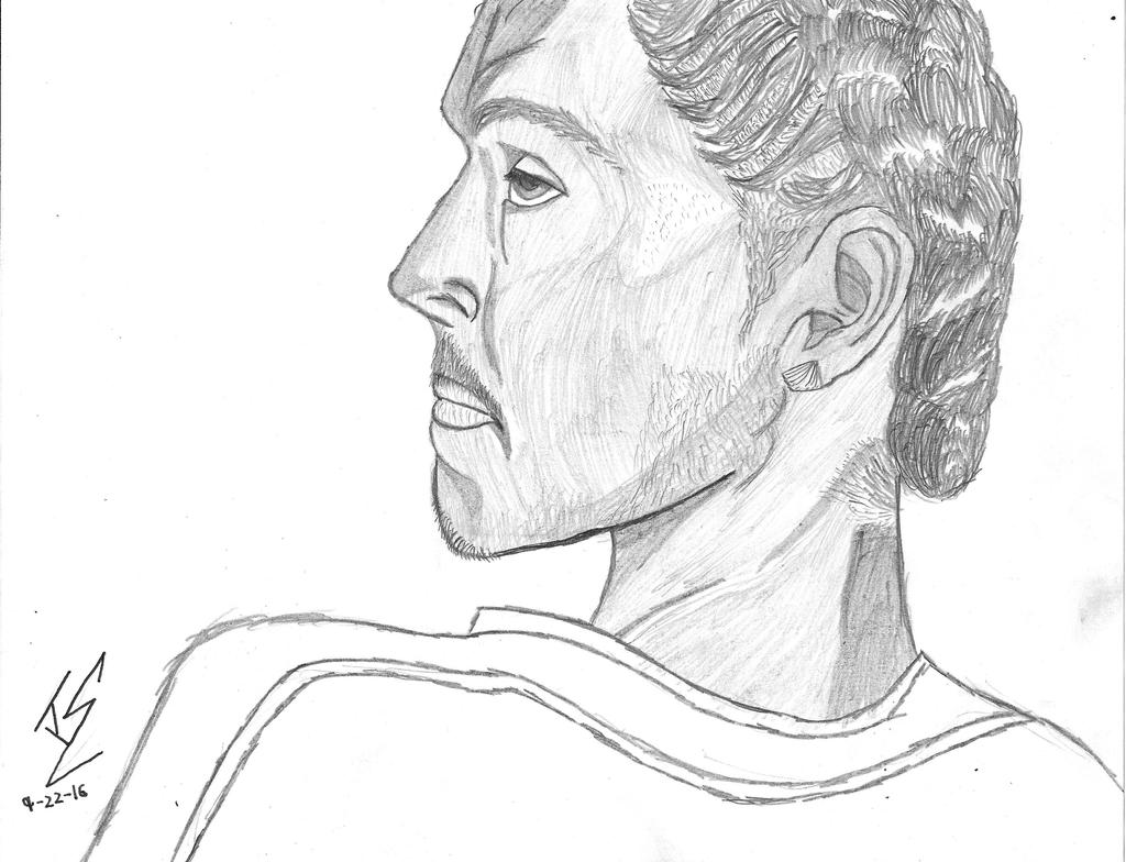
So you guys remember how a while ago I was given an in person request by a guy named Bravo? Well... there's an embarrassing story behind it.
The reason it took me so long to do this is because... this is real hard to admit... when I first drew this, I failed miserably and scrapped it. I tried again and actually liked my product to the point thinking it'd be the one... but like an idiot, I tripped in school, my binder fell, artwork flew out and landed in a perfectly placed puddle of water...
"... MOTHER FUCKER!!!"
So after being very disappointed and venting out on my comic for a bit, I picked up my pencil once again and had at it. And while I think it's not perfect by any means, I think I did a pretty decent job!
So this is a person Bravo knows (probably friend or cousin) and he just sent me the picture and I had at it. He wanted it in pencil because I knew it'd be the most realistic compared to markers... man I haven't drawn in plain graphite in a long time... I kinda miss doing that actually... So now here it is. I like the multiple techniques I used, but I'll save that for you guys.
Please critique and comment below, every helpful advice and comment really helps me out. Thanks for being awesome guys, and next stop is the Dark Souls Comic.
Image size
3293x2521px 1.09 MB
© 2016 - 2024 Rexlare
Comments5
Join the community to add your comment. Already a deviant? Log In
This drawing really captures a good understanding of shading, of texture, and of personality in the eyes.
As I've continued to view and assess this individual's art, I've come to realize that visible lines is part of your style more so than a lack of draftmanship. The shading for the cheekbones, for example, is very well done, and successfully gives the illusion of three dimensions. It's liney texture manages to not take away from that illusion.
That being said, there are aspects about the lips that imply struggle, which is pretty common, and I still deal with as well. Unless the face in the drawing is pursing his lips, the lips normally push outward a little more. It's seldom this flat. For expressions that involve the mouth moving, normally that changes the orientation of the laugh lines. If the drawing were to argue that he's making some kind of pursed lips expression, the laugh lines would go inward and look rougher, because of the muscles that are exercised when pursing the lips. However, the laugh lines in this are relaxed, they and the eyes give the man a very tired or relaxed look. I think the extension of the bottom eyelid makes the drawing tend more towards a tired look than relaxed. So if you were to improve this, I would suggest moving the lips outward slightly. Nothing extreme, just enough that it doesn't look like the man is straining to pack his lips in his mouth.
Your ability to draw hair is very admirable. The eyebrows and curled hair are always very difficult to draw, but you pulled it off pretty well.
So now, I want to address how you did on the eyes and the brow.
The brow looks great, a nice angle and nicely curved too. The only thing I would say needs to be work on relating to it is the shading. Design wise, the way you shaded does have a nice balance and make the whole drawing look nice. But when put into thought, I struggle to figure where the light source for this drawing would be.
If it was directly above, the forehead wouldn't have dark shading.
If it was below, then much more of the profile would be darker, though it's hard to say exactly where.
If it was in front of the man, the forehead wouldn't be shaded.
If it was behind the man, the forehead would be shaded dark, but the neck wouldn't.
If the light source is where the viewer is, the chin wouldn't be shaded in this way.
If the light source was facing towards the viewer, the whole drawing would become mostly a silhouette.
And so on.
The eyes really add the tired feeling to the whole piece. I also want to point out that you did the eyelids very well. That being said, if the brow is this forward, you would want to add a bit more shading just above the eyelid. But again, that partially goes into light source arguing.
For the ear, the actual structure is pretty accurate, good job. Does he have an earring on? If that's an earring, I'd suggest going into shading to help emphasize a rougher texture, to help it look more separate from the ear.
I understand how hard it is to draw a human profile. Aside from shading issues, this is overall a wonderful achievement, and is a piece of art worth being proud of.